Quick, call CPS. (Creative protective services).
A conundrum of production design: Much of it is editing someone else’s pipe-dream into … something functional. I know how I felt when I saw my projects in my manager’s portfolio. Adding the finalized work to mine feels like I’m taking All the Credit.
The head designer can fly to Patagonia to help style the product shoot, select a palette to make any color-theory teacher proud, and come up with a template full of placeholders that looks very pretty, unless the real content upsets their carefully styled design. Which always happens.
(Hypothetically speaking, of course.)
Aside from being apparently incapable of working around such known unknowns, they might be entirely ignorant of color separations and crop lines. Especially now that one can create a portfolio without ever printing out any portion of it.
Original (paid) work can look dull. Fit the legalese equivalent of the Book of Genesis into a single page advertisement, or a 2 page pamphlet. It might be designing ballots, where even kerning has to get government approval. (For such a mind-numbing project in the moment, formatting ballots for the 2000 election is the most discussed gig I’ve had). Or a 300 page bilingual math textbook (Teacher’s Edition), while still staying within the parameters of a limiting style guide. To get the proper kerning style on a radix, or prevent postscript from flaking because you have embedded files with their own embedded files is a Herculean, sometimes Sisyphean, feat. It is also an invisible one, when you do it right.

The longer horizontal rule hopefully only looks broken because I’ve blown up the size. It didn’t print that way! Everything under those lines used a negative kerning style, possibly multiple times. Unless I was 11th hour rushed and the copyeditors allowed anchored text boxes in anchored text boxes, which would have needed to be fixed for the next edition.
Knowing how to make the styles work is huge. During an interview I got a touch unprofessional when I ranted about finding a + in the styles and having to comb through the entire [damned] document to clean it up and who does that? Turned out that was why they hired me.
When it is pretty, it‘s usually cleaning up a Posh Design House Ad Campaign. Undoing careless editing because the files arrived flat, or poorly cropped. Perhaps they assumed the client would pay their rates for a second round that might Still Be Wrong, rather than going to a comparatively cheaper production designer, who has to edit it again anyway, after it‘s poured into a multi-page template.

Flat image arrived with an unwanted lens flare. Did the leg angle and the ceiling hardware look too messy? I’ll never know.

Lens flare removed, shirt and ceiling reconstructed with the help of PhotoShop‘s rubber stamp tool, and … A Lot of Caffeine.

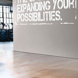
Flat image arrived with a stack of gym mats floating at an odd angle, with a careless drop shadow that contradicts the image.

Added a weird but suitably text-friendly wall with shadows that suggest it might actually be sitting on that floor.
I‘m still somewhat uncomfortable with taking Creative Credit. Then again, it requires my expertise to cross the finish line.
